On this page
Good website design feedback answers four questions before anyone has to ask them: where on the page, what is wrong, what should happen instead, and how much it matters. The browser, the screen size and the screenshot are context a feedback tool should capture for you. If the person fixing it can read your comment and start work without replying, the feedback did its job.
Why most website feedback stalls
Website feedback rarely fails because the reviewer is wrong. It fails because the comment cannot be acted on without a question. “The header looks off” leaves the developer to work out which header, on which page, at which screen size, and off in what way. Each of those questions is a round trip, and round trips are slower than they look: the reviewer answers when they next check their inbox, which is often the next day.
The vagueness is not carelessness. A reviewer looking at a page assumes everyone else sees the same page, and often they do not. The developer may be on a wider screen, signed in as a different kind of user, looking at a newer build, or using a browser that renders the font differently. “The header looks off” is a precise description of what the reviewer sees and a riddle to everyone else.
The second cause is scatter. Feedback that arrives by email, in a chat thread, on a call and in a shared document has no single list. Nobody can say what is still outstanding, items get fixed twice or not at all, and a review round that should take two days takes two weeks.
What good website feedback includes
A comment someone can act on has four parts. Only one of them takes much thought.
- Where. The exact element on the exact page. Not “the button” but the one you mean. Pointing at it beats describing it.
- What you see. The observation, stated plainly: the text overlaps the image, the form shows an error, the price is wrong.
- What you expected. The part most often left out, and the part a developer needs most. “Too big” is an opinion; “the same size as the headings on the pricing page” is a specification.
- How much it matters. Does it block launch, should it be fixed this round, or can it wait?
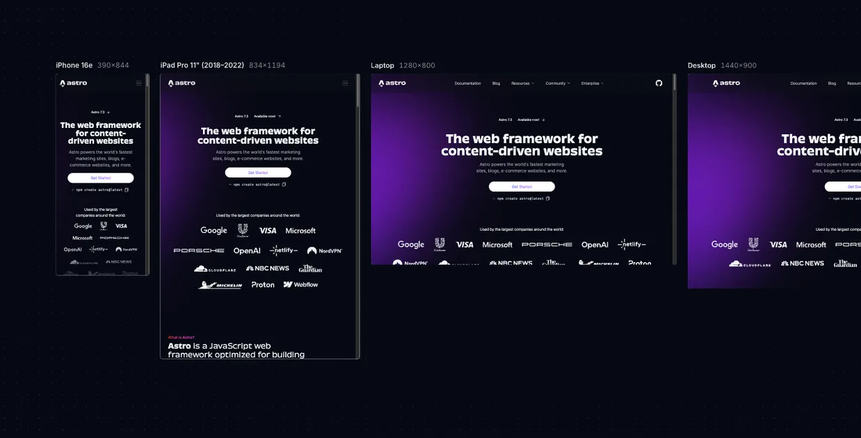
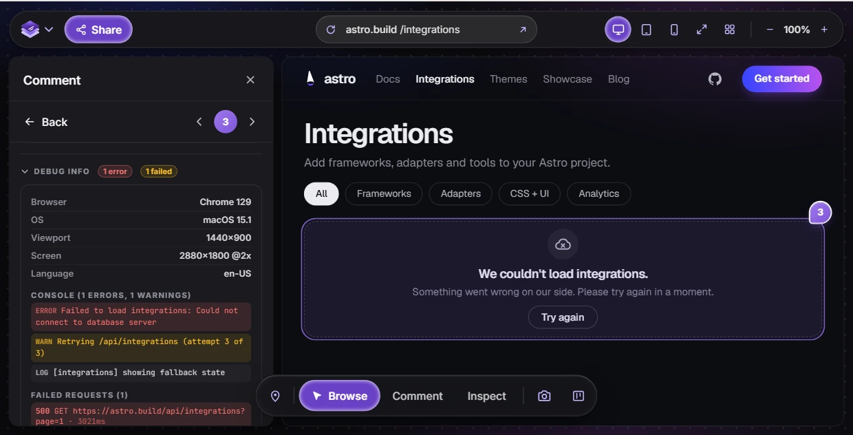
Everything else (the page URL, the browser, the window size, a screenshot of the moment) is context. It matters just as much, but a reviewer should not have to type it. If you are writing feedback by hand, add it to every item. If you are using a feedback tool, check that it records it for you.
A website feedback template
Copy this for each issue when you are writing feedback by hand, in an email, a chat thread or a spreadsheet row. Delete a line rather than guess at it.
Type:      Bug / Change / Question
Page:      https://example.com/pricing
Element:   The "Book a demo" button in the hero
Device:    iPhone 15, Safari (or: Chrome on a Mac, window about 1280px wide)
I see:     The button is the same grey as "Learn more" beside it.
Expected:  It stands out as the main action, in the brand purple.
Why:       Nobody can tell which button to press first.
Priority:  Blocks launch / This round / Later
Screenshot: attached, with the button circled
For a quick comment, the same fields fit in one sentence:
Seven rules for better feedback
1. Point at the element, don’t describe it
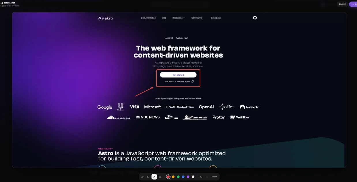
“The second button in the third section of the services page” takes a sentence to write and still leaves room to pick the wrong button. Click on it instead: pin the comment to the element, or take a screenshot and draw a box around it. Describing position in words is the most common reason a fix lands on the wrong thing.
2. One issue per comment
A comment with five problems in it cannot be split between two people, cannot be half finished, and cannot be closed until all five are done. Five short comments are faster to triage, fix and close than one long one, and nothing gets lost at the bottom of a paragraph.
3. Say what you expected, not only what is wrong
“This looks wrong” starts a conversation. “This should line up with the left edge of the text above it” ends one. If you do not know exactly what you want, describe the goal instead (“this needs to stand out more than the button next to it”) so the designer can propose the how.
4. Label bugs, changes and questions differently
A bug is something that does not work as intended. A change is something that works but should be different. A question needs an answer, not a code change. Mixed together, every comment looks like work for a developer. Start each one with the word (“Bug:”, “Change:”, “Question:”) or use your tool’s labels if it has them.
5. Show anything that moves
Hover effects, animations, menus, forms and anything that happens after a click are hard to describe and harder to reproduce. List the steps (“open the menu, tap Services, tap back: the menu stays open”), or record a short screen video and talk over it. Thirty seconds of video replaces a paragraph of steps the reader would still get wrong.
6. Give the reason for a preference
“Make the logo bigger” invites a debate. “Make the logo bigger: at phone width it is smaller than the menu icon, and the brand guide sets a minimum of 32px” is a request with its reason attached. The reason also lets the designer find a better fix than the one you suggested.
7. Say how much it matters
The team cannot guess which comments you care about most. Mark each one as a launch blocker, something for this round, or something for later. Nothing stops a review round growing into a redesign faster.
One habit sits underneath all seven: review the version you were asked to review. Check you are on the link you were sent (this round’s staging build, not an old preview or the live site). Feedback on a page that has since changed is feedback on a site that no longer exists.
Website feedback examples: six rewrites
Each rewrite below is at most a sentence longer than the original, and each removes at least one round trip. None of them needed technical knowledge.
Before
“The header looks weird on mobile.”
After
“Bug: on the pricing page at phone width, the logo overlaps the menu button. They should not touch; shrink the logo or move the button. Blocks launch.”
Before
“Can we make this pop more?”
After
“Change: the “Book a demo” button in the hero is the same grey as the “Learn more” button beside it, so neither reads as the main action. Can “Book a demo” use the brand purple? This round.”
Before
“The form is broken.”
After
“Bug: submitting the contact form with a valid email shows “Something went wrong” and nothing arrives in the inbox. Tried twice, Chrome on a Mac. Blocks launch.”
Before
“Fix the spacing.”
After
“Change: the gap between the three testimonial cards is about twice the gap above them. Make the gaps equal, matching the cards in the features section. This round.”
Before
“I don’t like this photo.”
After
“Change: the team photo on the About page predates the last two hires. Swap in the new one from the shared drive. After launch is fine.”
Before
“The refund info is wrong.”
After
“Question: the FAQ says refunds are available for 14 days and the terms page says 30. Which is right? Once we know, both pages should say the same thing.”
Tips for clients, designers and PMs
If you are the client or a stakeholder
- Review in one sitting before the round’s deadline if you can. Comments that trickle in over a week are harder to act on than the same comments delivered together.
- Comment on what the site does for your business: accuracy, clarity, whether your customers will understand it. Leave pixel measurements to the designer.
- If you are not sure whether something is a bug, ask it as a question. Nobody minds.
- Tell the team who else is reviewing, so contradicting comments are settled before they reach a developer.
If you are a designer
- Refer to the design system by name where you can: the spacing step, the type style, the component. “Use the Heading 3 style” leaves nothing to interpret.
- Check the built values before commenting on them. An inspect tool shows the real font size, padding and colour, which is more reliable than eyeballing a screenshot.
- Draw on the screenshot when alignment or spacing is the point. A box and an arrow say in a second what takes a paragraph to write.
If you manage the project or run QA
- Consolidate before forwarding. Two stakeholders asking for opposite things should reach the developer as one decision, not two tickets.
- Sort every comment into bug, change, question or out of scope, and answer the questions yourself where you can.
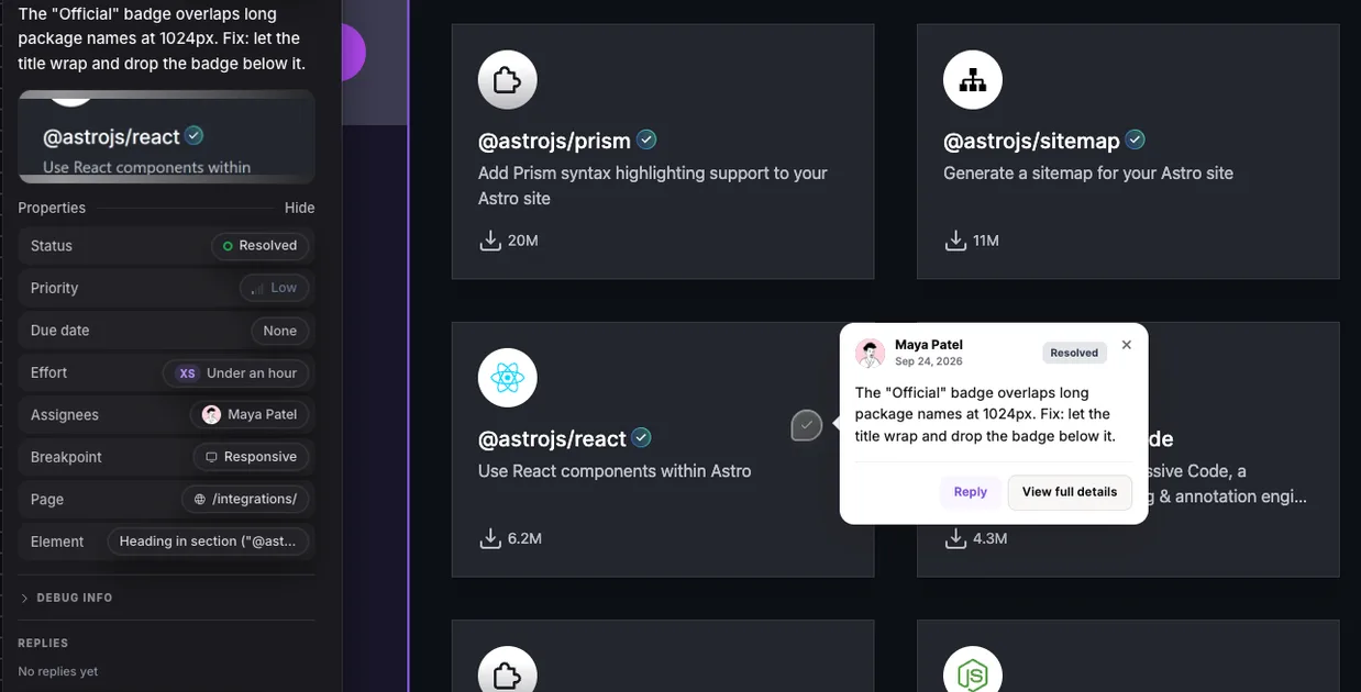
- Close the loop. Mark items fixed or declined with a line of reason, so reviewers trust the list and stop reporting the same thing again.
For how to structure the rounds themselves, see a website review process that gets to sign-off.
Where to leave it
The medium matters less than the four parts, but it decides how much of the context you have to type yourself.
- Email or chat. Fine for a handful of comments. For every item, include the page URL, a screenshot with the element marked, your browser, and your device or window size. Number the items so replies can refer to them.
- A shared document or spreadsheet. One row per issue, with columns for page, element, what you see, what you expected, priority and status. Better for tracking, but the screenshots live somewhere else and go stale.
- A website feedback tool. You click the element on the live page and type the comment; the tool records the page, the element, a screenshot, the browser and the screen size. Worth it beyond a few comments, and especially for reviewers who are not technical. Our comparison of 17 website feedback tools covers the options, free ones included.
In LayerDock, the team sends reviewers a link. A reviewer opens it, types their name and clicks the element they want to comment on, with no account and nothing to install. Each pin records the element, a screenshot, the page URL, the browser and the viewport. Reviewers can draw on the screenshot, and on the paid plans they can record their screen as well. Try it on any public site without signing up.