On this page
A website QA checklist is the list of things to test before a site goes live: that the content is final, the layout holds at every screen size, links and forms work, pages load fast, search engines can index them, people using assistive technology can use them, and tracking records what it should. The 50 checks below are grouped in that order. Run them on staging before anyone outside the team sees the site, then repeat the production-only checks on launch day.
How to use this checklist
Work through it on the staging site first, as the opening stage of the review. Every problem caught here is one a client never sees and nobody has to write up, discuss and close. It also means stakeholders spend their review on what only they can judge, rather than on a broken link.
- Split it by skill. Content checks go to whoever owns the words, performance and SEO to a developer, layout and forms to anyone careful. Where you can, have someone check pages they did not build.
- Check templates, then pages. Most sites are a handful of templates filled with different content. Test each template thoroughly, then scan every page for the things that vary: copy, images, forms.
- Repeat the production-only checks after launch. Indexing, HTTPS, redirects, analytics and monitoring only mean anything on the live domain, so run those again once it is live.
- Look as a first-time visitor. Use a private window with the cache cleared, so you see what a new visitor sees rather than what your browser remembers.
- Report as you go. One issue per report, with the page, the element and the evidence. There is more on this at the end.
Take it with you. All 50 checks as a Markdown task list for Notion, Jira, Linear or a GitHub issue.
Content
Content errors are the ones clients notice first and forgive least, because they are the part of the site they know best.
Placeholder text is gone. Search every page for lorem ipsum, “TBC”, “XXX” and template headings. Check image alt text and meta descriptions too; placeholders hide there.
Spelling and grammar are checked. Read each page in full rather than skimming. A spell-checker catches typos, not the wrong word spelled correctly.
Facts match their source. Prices, phone numbers, addresses, opening hours, dates and legal names match the approved source character for character.
Names and terms are consistent. The company, the products and key features are written the same way on every page, capitalisation included.
Images are final and licensed. No watermarked stock or low-resolution stand-ins, and a record of the licence for every image you did not create.
Legal pages exist and are linked. Privacy policy, terms, cookie policy and any accessibility statement or company details your market requires are published and linked from the footer.
Layout and screen sizes
Most visitors will not see the site at the width it was designed at. Check the widths people actually use, and the awkward ones in between.
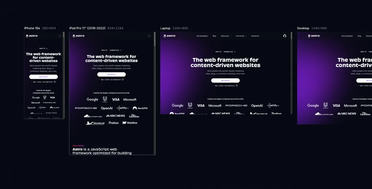
Check four widths, and the range between them. Phone (about 390px), tablet (768px), laptop (1280 to 1440px) and a large desktop. Then drag the window slowly through the whole range: many layout bugs live between breakpoints.
Nothing scrolls sideways on a phone. At phone width nothing should push the page wider than the screen. A long word, a table or an embed is the usual cause.
Text fits its container. Buttons, cards and menu items hold their longest real label without overflowing or breaking mid-word.
Images keep their proportions. Nothing is stretched or squashed, and cropped images still show their subject at every width.
Tap targets are big enough. Buttons and links on touch screens are around 44 by 44 pixels (Apple’s guideline; WCAG 2.2 sets a floor of 24), with space between neighbours.
Sticky elements do not cover content. A fixed header must not hide the heading an anchor link scrolls to, and a cookie banner must not cover the only button on the page.
Spacing and type match the design. Headings, body text, spacing and colours match the design system. Compare the built values, not two screenshots side by side.
Links and navigation
Broken links are cheap to find with a crawler and embarrassing to leave in. Run the crawl on staging and again after launch.
Every link resolves. Run a link checker across the site and fix every 404 and every chain of redirects.
Nothing points at staging. Search links, images and scripts for the staging domain. It is one of the most common launch-day mistakes.
External links go where they should. And open in a new tab only where that was intended.
Anchor links land on their section. Especially on pages with a sticky header, which can hide the target heading.
The 404 page helps. It exists, matches the rest of the site, and offers a way back: search or the main links.
Forms and interactions
Forms are where a site earns its keep, and where a bug costs real enquiries or sales. Test every one end to end, including what happens after it is sent.
Forms submit with valid data. And the entry arrives where it should: the inbox, the CRM, the spreadsheet. Check the receiving end, not only the success message.
Validation is clear. Submit empty and invalid values. Each error says what is wrong, sits next to its field, and the other values survive.
Double clicks do not double submit. Clicking submit twice quickly sends one entry, not two, and never charges twice.
Confirmation emails send and render. Check the sender name, the subject line, the links, and how the email looks on a phone.
Spam protection lets people through. After adding a captcha or honeypot, send a normal submission to prove real visitors still can.
Menus, modals and accordions behave. They open, and close with their button, the Escape key and a click outside, without leaving the page unable to scroll.
Search, filters and embeds work. Site search returns sensible results, and maps, videos and booking widgets load on every page they appear on.
Browsers and devices
Emulators and responsive modes catch most layout problems but not all of them. Keep at least one real phone in the loop.
The major browsers. Current versions of Chrome, Safari, Firefox and Edge.
A real iPhone. Safari on iOS behaves differently from Safari on a Mac and from a desktop browser’s phone emulation, especially with fixed elements, viewport height and zoom on form fields.
Fonts load everywhere. No fallback fonts on some browsers, and no text that stays invisible while the font loads.
Dark mode does not break it. With the operating system in dark mode, form fields, logos and embedded content are still readable.
Performance
Test on a phone connection, not the office network. Performance is also a search ranking signal, so it belongs on the launch list rather than the one after.
Mobile scores are in the green. Test with PageSpeed Insights on mobile against Google’s “good” thresholds: Largest Contentful Paint within 2.5 seconds, Interaction to Next Paint within 200 milliseconds, Cumulative Layout Shift below 0.1.
Images are sized and compressed. Served in a modern format such as WebP or AVIF, no larger than their display size, and lazy-loaded below the fold.
The main image loads first. The hero image is usually the Largest Contentful Paint element, so it must not be lazy-loaded.
Nothing jumps while the page loads. Images and embeds have space reserved for them, and a late web font does not reflow the text.
Third-party scripts earn their place. Remove unused tags, trial widgets and anything left over from development.
SEO
Launch is when search engines first see the site properly. A few settings decide whether they can index it at all.
Search engines are allowed in. Remove the staging “noindex” tag and any robots.txt rule that blocks the whole site. Few mistakes hide a new site more completely.
Every page has its own title and description. Titles of roughly 50 to 60 characters, and descriptions that say what the page is for. No two pages share either.
One H1 per page, headings in order. The H1 says what the page is about; H2s and H3s follow in sequence without skipping levels.
Old URLs redirect. If this replaces an older site, map every old URL to its new home with a permanent (301) redirect.
The sitemap and canonical tags use the live domain. The XML sitemap lists live URLs on the production domain, and canonical tags point there too, not at staging.
Shared links preview properly. The Open Graph title, description and image appear when a page is pasted into chat or social apps.
Accessibility
These are the checks that catch the most common barriers quickly. They are a floor, not a full audit: a site with legal accessibility obligations needs one.
Meaningful images have alt text. And purely decorative images have empty alt text, so screen readers skip them.
Text has enough contrast. At least 4.5:1 for body text and 3:1 for large text, the WCAG AA levels.
Everything works with a keyboard. Tab through each page: every control is reachable, in a sensible order, with a visible focus outline.
Form fields have real labels. Visible labels, not placeholder text that disappears as soon as someone starts typing.
The page survives 200% zoom. At 200% browser zoom, nothing is cut off, overlapping or unreachable.
Tracking, security and launch day
The last group is mostly about production. Run it once the domain points at the new site.
Analytics records visits and conversions. Watch the analytics tool’s real-time view while you load pages and complete a form or purchase, and confirm each event arrives.
The cookie banner does what it says. Where your visitors’ law requires consent, tags that need it do not fire until it is given.
HTTPS everywhere. The certificate is valid, plain HTTP redirects to HTTPS, and no image or script still loads over HTTP.
Staging access is gone. Test accounts, staging passwords and debug modes are off in production, and admin accounts use strong, unique passwords.
Someone is watching after launch. Uptime monitoring and error tracking are on, a backup exists, and a named person checks the site the morning after launch.
Reporting what you find
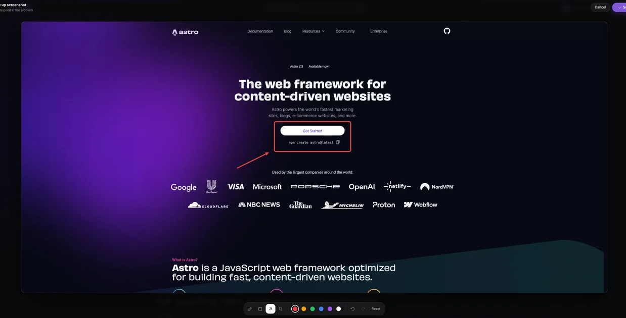
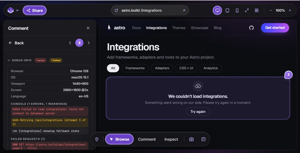
A QA pass is only as useful as its reports. Each issue should reach the person fixing it with the page URL, the exact element, a screenshot, the browser and screen size, the steps that trigger it, and for anything broken, the console error or failed request behind it. Without those, the developer has to reproduce the bug before they can start on it. The guide to reporting a bug with a screenshot and console errors covers what each piece is for.
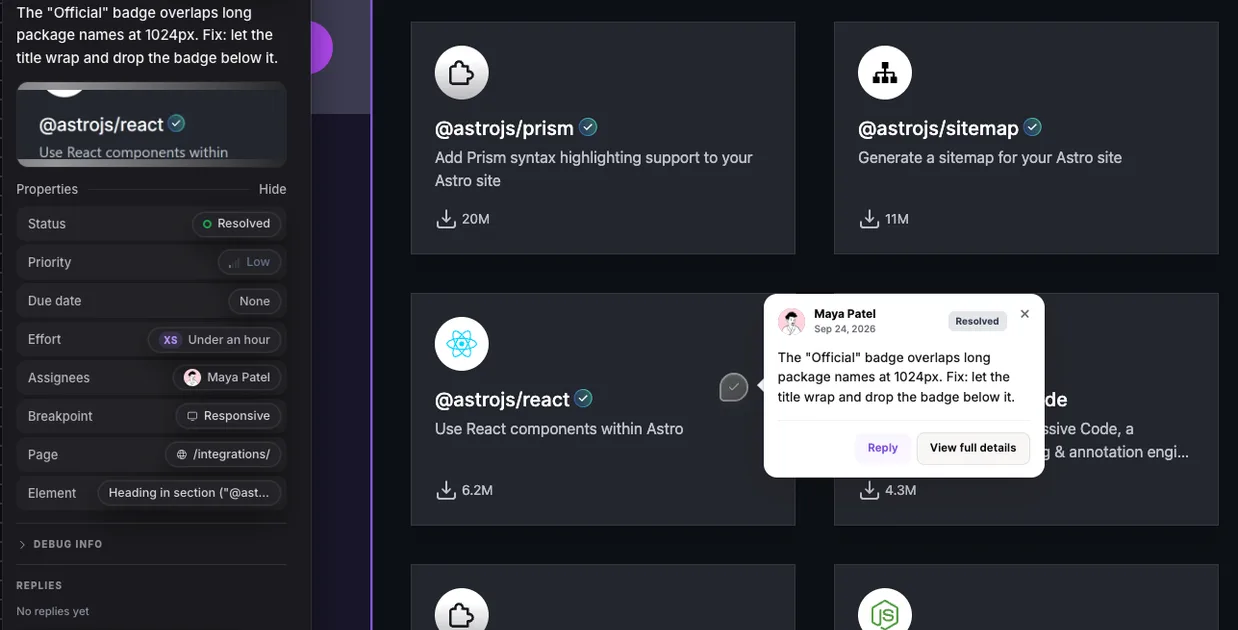
LayerDock gathers most of that for you. Open the review link and switch between desktop, tablet and mobile widths from the same page, use Inspect mode to read an element’s real spacing, type and colours (on every plan), and click an element to pin the problem to it. Each pin records the selector, a screenshot, the page URL, the browser and the viewport. The console and network activity are recorded with every pin too, and reading them is part of the Agency plan. More on the QA side is on the website QA testing tool page.
Writing reports by hand? Use the template in how to give website feedback, and if a coding agent will pick the bugs up, see the bug report template for AI agents.